
Collaborating With UX: A Guide For Project Teams is an e-learning course I designed and developed for software development project leaders, stakeholders, and team members who have never worked directly with UX professionals and need to understand how to get the most value from their UX investment. Originally a simple, five-slide PowerPoint presentation that I would present at the start of projects at Equitable, it eventually evolved in into a full-blown, interactive Articulate course. Click “View Course” to see a sample section from the larger course.
Development: Articulate Storyline 360
Visual Design: Adobe Photoshop, Adobe Illustrator, Chat GPT
Prototyping: Figma
Software development projects at the client company operated under the model where individual UX contributors would be assigned to a given project and then work closely with that team or business unit, providing a range of design services and deliverables in support. However, delivery managers and project teams were often not clear on what value UX provides beyond “making it look pretty,” and were consequently not sure how to effectively integrate UX into the overall project workflow.
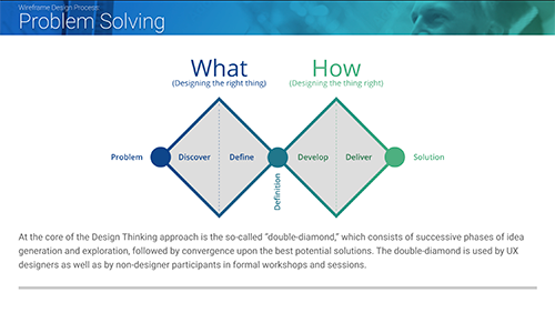
After noting that post-project wrap-ups and retrospectives were consistently identifying this gap in understanding as a problem, the UX team interviewed employees from a variety of UX and non-UX roles to learn where the gaps in understanding existed from multiple perspectives. We arrived at the solution of preparing a short (appx. 5 minutes) presentation to be presented at project kickoff to introduce the larger project team to the UX function. The presentation in its original form was a simple introduction to core UX terminology, processes, and concepts that wasn't intended to be a comprehensive training experience, but more of a conversation starter.
Although the initial thinking was to keep it "short and sweet" to avoid the possibility of overwhelming the audience with new information about an unfamiliar subject, the feedback to the presentation was that it was quite helpful, and that contrary to the approach of presenting only basic overview of UX, many reviewers expressed a desire to learn more. As a result, the presentation was expended over time until it became a more in-depth overview of what UX does along with best practices for effective collaboration between UX and non-UX functions.
As the presentation grew and the logistical limitations of scheduling increasingly lengthy presentations became apparent, it was decided to repurpose the full version as a stand-alone, interactive e-learning course that could be accessed as needed on the company’s training and development portal.

A slide from the original presentation. Lots to unpack in there, which the presenter (usually me) would have to explain and walk through with the learners.
The original presentation was mostly lots of bulleted text, with the presenter elaborating, filling in the blanks, and answering questions. The content therefore needed to be rewritten to account for the fact that this would be a stand-alone, self-paced experience. This wound up being a somewhat unique experience for me since as an experienced UX professional, I functioned as both designer and subject matter expert on this project. Although I consulted extensively with my UX colleagues to determine the optimal range of topics to cover and the accuracy of the material, as lead content developer I was ultimately faced with the challenge of balancing the desire for comprehensive (i.e. lengthy) treatment of the subject matter with the need to keep a constant eye on how the content presentation would flow within an e-learning experience. My past experience as a technical writer proved invaluable in this regard, since the need for clear and succinct writing in technical documents was applicable here as well.
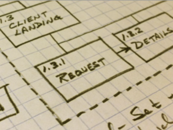
The original presentation's slides functioned as storyboards on this project, so we didn't bother to create an additional set of formal documentation. Instead, we moved directly into Figma to explore possibilities of interactive flow and navigation. The main consideration was to ensure that the course content was presented in a way that wouldn’t confuse someone new to the idea of user experience.
Since this was a tech-oriented subject matter, I went with a cool blue/green color scheme that also aligned with the company’s branding. While many slides needed nothing more than a simple visual to accompany the content, others needed more specific illustrations or graphics to represent a process, for example. As is the case with most design projects, I spent quite a bit of time going back and forth between Photoshop and Illustrator to create the finished imagery.
One of the main challenges was to upgrade from the text-heavy, linear presentation of content that existed in the original presentation into a more engaging interactive experience enabled by modern e-learning platforms like Articulate. Since developing elaborate simulations or branching scenarios was deemed out-of-scope, we instead decided to introduce simple interactions such as card flipping, collapse/expand content reveals and the like to stimulate engagement and make the course more than just a linear reading experience.
I designed the screen in this example for a tool used by Equitable's internal Employee Benefits (EB) users to manage benefits packages at the group level. In EB, groups are organizations that provide benefits to individual members (e.g., employees), but the details of what coverages each group provides are unique.
The business unit had identified the need for a feature to set up new groups in the system to manage their requests and had drafted the basic requirements for what the new feature must accomplish. How it would sit within users’ workflows, screen layout, and functional behaviors were left to the designers to figure out.
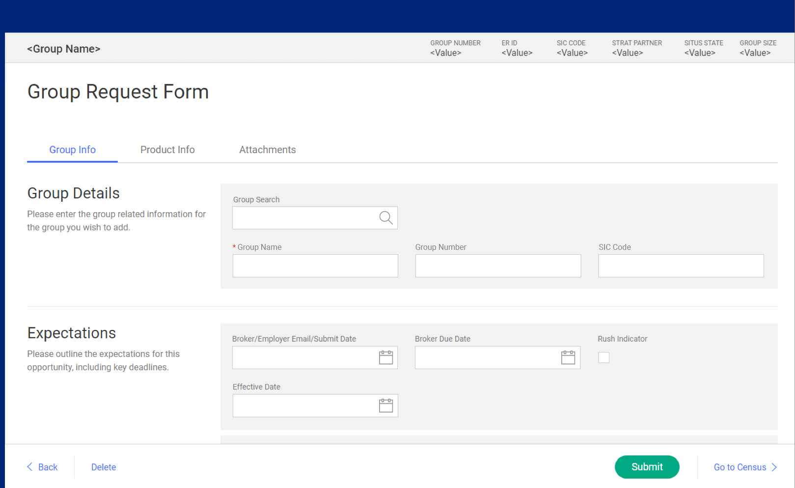
Employee Benefits Group Request form